
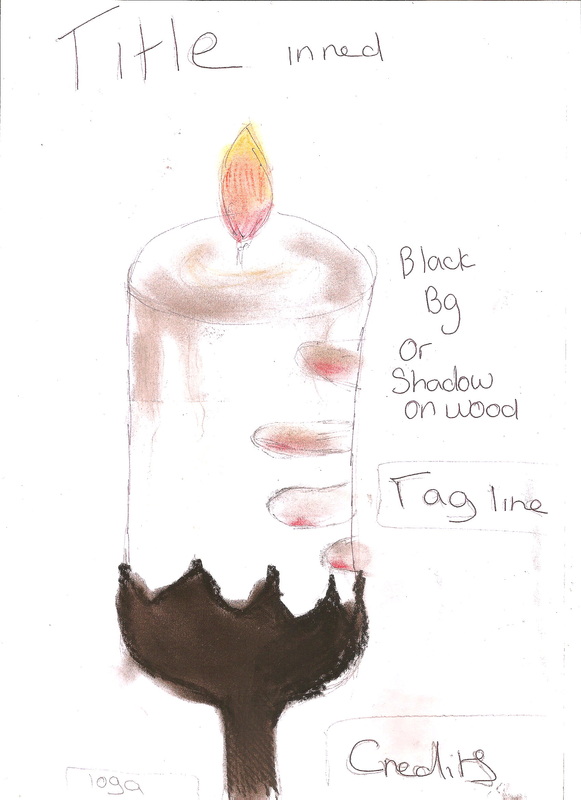
Movie poster draft
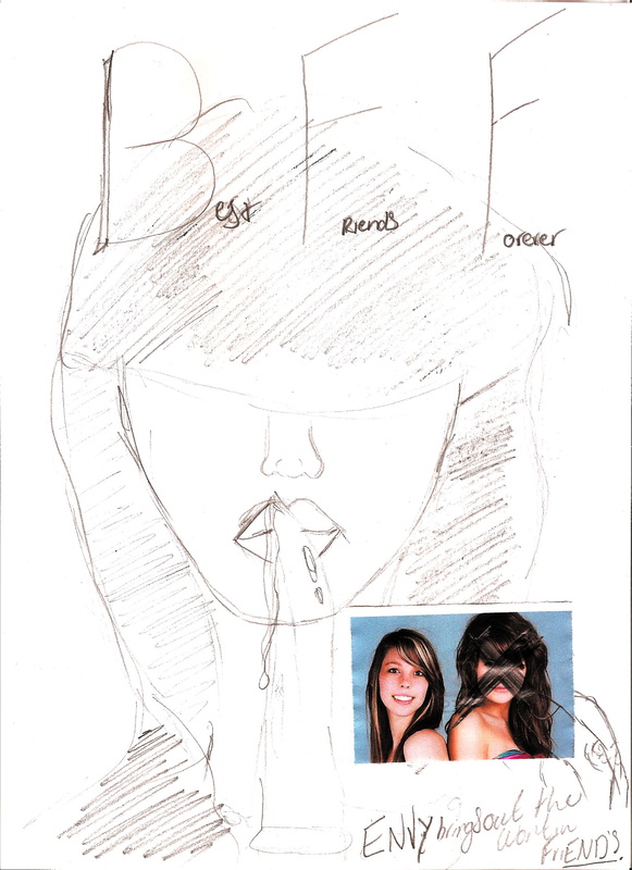
this was the idea for our poster, it was the main idea for the front cover of the magazine but it was to busy to use. The reason why we picked to do this as a poster was because the audience will know who it is but the characters in the film will not.
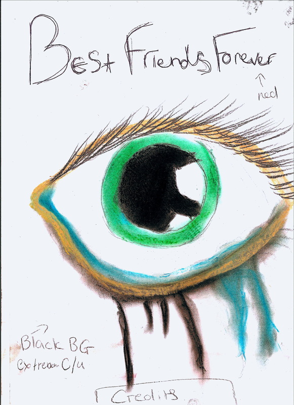
wE WERE GOING TO USE A PICTURE OF BOTH OF THEM AS FRIENDS AND SCRIBBLE THE DEMI's face out to show the intention of her plan.
wE WERE GOING TO USE A PICTURE OF BOTH OF THEM AS FRIENDS AND SCRIBBLE THE DEMI's face out to show the intention of her plan.
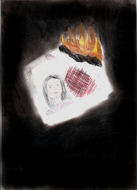
THE SECOND IDEA THAT WE HAD WAS TO SHOW ONE OF THE VICTIMS BEING HUNG/DRAGGED.
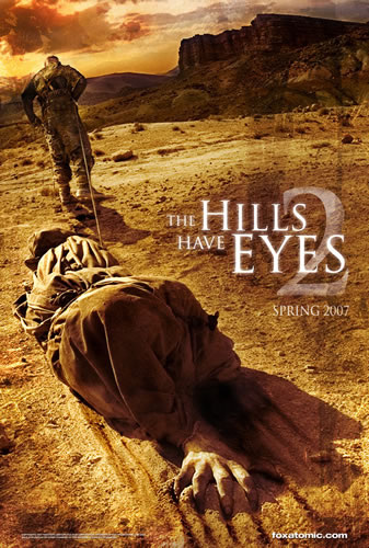
tHE REASON WHY WAS CAUSE NOT MANY HORROR MOVIE POSTERS SHOW A CLOSE UP OF THE KILLER trying cover their identity SO WE THOUGHT IT WOULD BE A BETTER IDEA TO STICK TO CONVENTIONAL THEMES FOR THE POSTER. for example the poster beneath of the hills have eyes 2 shows torture being used, the focus when the poster is first noticed id drawn to the figure on the floor. this is the type of poster we wish to produce as it shows fear and doesn't give too much of the story away.
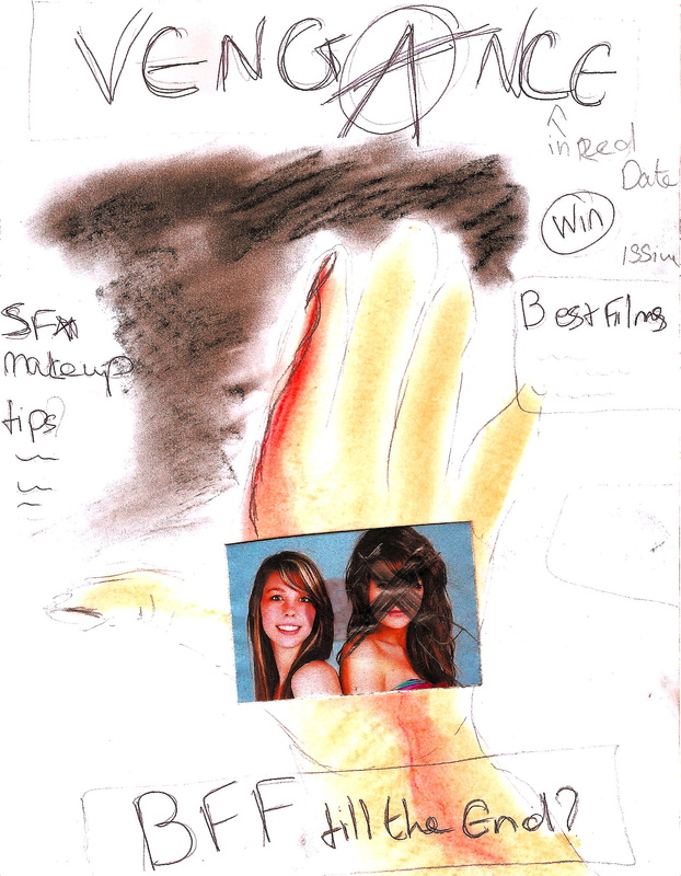
For the setting we wish to have it in a dull-lit room and for the killer to be cut out of the picture so that it still remains unknown to a certain extent who the killer is.
tHE REASON WHY WAS CAUSE NOT MANY HORROR MOVIE POSTERS SHOW A CLOSE UP OF THE KILLER trying cover their identity SO WE THOUGHT IT WOULD BE A BETTER IDEA TO STICK TO CONVENTIONAL THEMES FOR THE POSTER. for example the poster beneath of the hills have eyes 2 shows torture being used, the focus when the poster is first noticed id drawn to the figure on the floor. this is the type of poster we wish to produce as it shows fear and doesn't give too much of the story away.
For the setting we wish to have it in a dull-lit room and for the killer to be cut out of the picture so that it still remains unknown to a certain extent who the killer is.
|
|
|
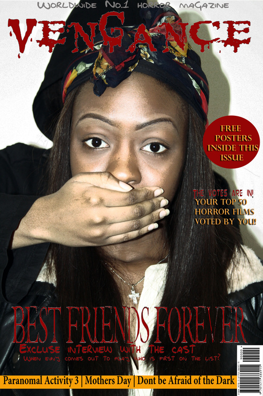
Magazine front cover draft.
This was the first idea we had for our magazine front cover, like the genre we picked it would not be bloody but just create the idea of fear. We chose this idea as most magazine front covers prefer a shot that puts the photo on the cover eyeline with the person buying it, It'S ALSO USED TO STAND OUT.
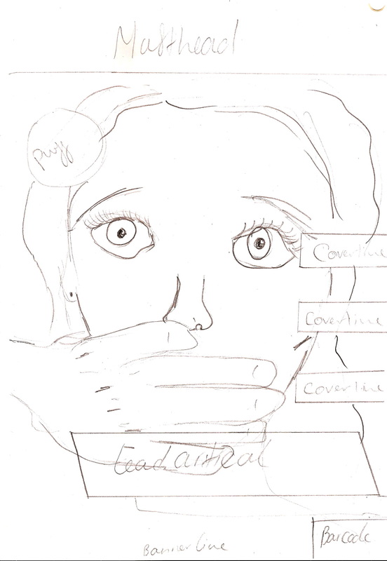
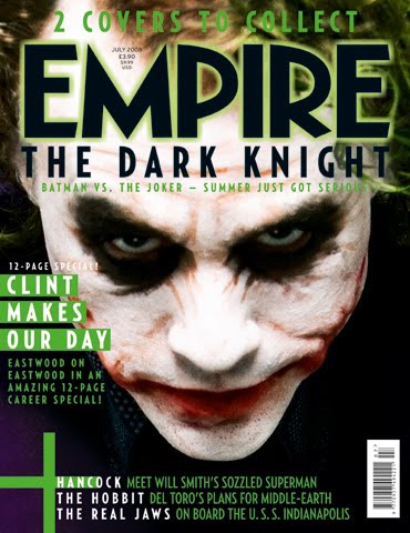
This was the example that we used when we were planning out what shot we wanted for our front cover. it shows the eyeline shot that we wanted to use.
tHIS IS A SHOT OF OUR POSTER FRONT COVER AT THE WORKING STAGE. tHE FINISHED PRODUCT HAS A DATE AND PRICE ADDED, AS WELL AS MORE COVERLINES AND THE TEXT ON THE PUFF HAS BEEN STRAIGHTENED OUT.
tHE FONT THAT DISPLAYS THE TITLE OF OUTR FILM HAS BEEN KEPT THE SAME ON BOTH MAGAZINE FRONT COVER AND OUR POSTER TO SHOW THE CONNECTION WITH THEM BOTH.
tHIS IS ALSO BECAUSE THE FILM TITLE IS LIKE A BRAND AND ALL PRODUCTS THAT PROMOTE THE SAME PRODUCT HAVE TO LOOK SIMERLER.
tHE FONT THAT DISPLAYS THE TITLE OF OUTR FILM HAS BEEN KEPT THE SAME ON BOTH MAGAZINE FRONT COVER AND OUR POSTER TO SHOW THE CONNECTION WITH THEM BOTH.
tHIS IS ALSO BECAUSE THE FILM TITLE IS LIKE A BRAND AND ALL PRODUCTS THAT PROMOTE THE SAME PRODUCT HAVE TO LOOK SIMERLER.
Font
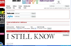
For both poster and magazine we intend to use this font in blood red.
