A Textual Analysis of a Movie Magazine Front Cover
Sweeney Todd
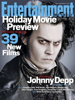
Entertainment weekly is a American based magazine published weekly by Jess Cagle. The magazine was originally set up by Jeff Jarvis. Its first issue was published in February 1990 and it sold 1.7 million in the first week. It has been a world widely good way to advise the public about up and coming movies and television programmes. It sells extremely well in the western world.
The denotation of the magazine varies from different colour schemes depending on the film cover. With this particular magazine colour it is very vague and has a grey under tone. This obviously represents the director’s vision of what he wants to represent the film. The main image of Johnny Depp , who plays Sweeney Todd is a medium close up. The actor/models facial expressions is quite stern and sharp, the NVC comes across very strongly from one facial pose. Johnny Depp’s costume wear is Victorian themed as that is when the film/drama was scripted in. When you see the clothing you recognise that it may be a period drama movie. The lighting looks to have been with flash to expose the photo to more light. His pale make up gives off an evil, villain feel from it.
The camera shot of Johnny Depp is a portrait image and is taken from a medium close up shot. Each side is symmetrical and has a matching tone with a plain photoshoped background. The layout of the magazine is; the masthead is at the top of the product, with a date line and issue number. The second line on the magazine is the sub heading which is a catchy line after the title to give the magazine something to stand out from the others on new stands. The cover lines are all to do about Johnny Depp and his role in Sweeney Todd these are to promote the movie and actor more that they are already exposed. The magazine adds other famous actors and actresses that are up for Oscar nominations.
This magazine is unusual it doesn’t follow the typical conventions of a national magazine. It doesn’t have a barcode, price, headlines that feature other people and other projects. Apart from that the magazine sends a good signal to persuade the audience to purchase it.
With a name like Entertainment Weekly it always has interesting stars on the cover to attract the target audience, the viewers. Magazine like these are small things that add revenue to the media industry. Even though it doesn’t seem so popular among people in my generation it is one of the main ways apart from the internet where people can find information about the latest movies. Television programmes and scheduled programmes.
A Textual Analysis of a Movie Poster
Sweeney Todd
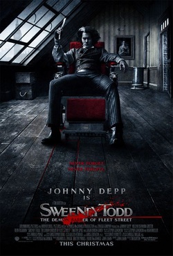
The 2007 remake of the world known drama Sweeney Todd was a massive success when it his box offices. Tim Burton had an amazing cast of actors from Johnny Depp, Helen Bonham Carter and Alan Rickman. The film which is based on a barber who kills his victims, by slicing their throats and sending them down a secret passage way.
The mise-en-scene used on the movie poster is quite tedious and dull. Sweeney Todd (Johnny Depp) is sitting in a barber’s chair with a prop which is a shaver. His costume is a very typical inspired 19th century look, which consists of a shirt, vest, waistcoat, tailored trousers and boots. The lighting in the photograph is natural with some grey scale added to it; this is meant to connote the revenge that he is looking for. The colour scheme of black, white and red are colours we associate with negative views. The setting of the poster is in an attic of a property. Johnny Depp’s NVC is very poised and can be misconstrued as intimidating.
The camera angles used on this poster is a long shot. You see the characters whole body and the background/surroundings that he is in. The focus of the image is quite harsh and has a deep depth of field. The picture looks like it has been sketched instead of developed from a camera. This connotes that the film is a period drama and is set in the 1800’s.
The colour composition is harsh and direct. Black is a colour that we connote with death, which in this movie is the main plot. Grey is recognised with dull, boring and upsetting this could be playing with how the character Sweeney Todd is feeling after the current events. Red has the connotation of love and blood; this connotes the love he has for his family which was taken away from him and also the blood that he is revenging from the villains. The natural light coming through the window and door could connote the freedom of his unsettling feelings.
The caption “SWEENEY TODD, The demon barber of fleet street” has a catchy alert to it. The blood splatter behind the caption gives the appeal that you will be enjoying gory thriller. The text font is sharp and structured, just like a knife or sharp instrument which Sweeney Todd uses to kill his victims. Its metallic silver with a red underline, this denotes the storyline of Sweeney Todd. The use of capital letters makes the name more dominant. The font is large enough for us to view but does not take our attention away from Johnny Depp on the barber chair.
Overall I feel that poster relates well with the theme of the film. From the costume, lighting, captions, fonts and editing it all kind of tells you the piece of the story before seeing the actual film. I believe that the poster does a good job at pursudaing us as the target audience to go and pay money to see a good value of film. This movie poster is a good example of what the standard techniques of editing can do to such a simple image. The overall persona of the poster gives off the thriller/ horror in a persuading way. How ever I think they should have added the age range on the product. This would have given the audience information about what the critics rated the violence and gore of the movie. However the movie poster is consistent with the movie teaser trailer and gives the target audience more and more suspense of wanting to watch the film.
A Textual Analysis of a Teaser Trailer
Sweeney Todd
I will be writing my teaser trailer textual analysis of the movie Sweeney Todd (the remake 2007). In the movie Sweeney Todd the main character played by Johnny Depp is Benjamin Parker, he is then taken away by a man of power and his family and identity was vanished. He reappears as Sweeney Todd and he has come back for revenge of the incident that took place. Tim Burton is a well know director and has directed films such as Batman Returns, Alice in wonderland and Edward Scissorhands.
As Sweeney Todd was set in the 1800’s they costume of clothing was very Victorian and vintage. Men in the Victorian days would wear vests, waistcoats and waistline trousers. The women of the 19th century wore corsets, blouses and skirts. The Mise – en- scene in Sweeney Todd is very simple and recognisable for the audience. The NVC that the characters use is standard and proper English for the 19th century. They use terminology that has been changed and developed over the last century. Tim Burton also used a few musical queues for the characters to part take in. Johnny Deep who plays Sweeney Todd is has many singing stage lines.
