Analysis of a horror magazine front cover.
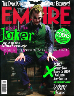
The main feature photo captures the audiences attention the most as the main cover line relates to it. Furthermore, the audience can establish eye contact that is being interviewed in the edition as he is looking directly at the camera which therefore engages potential readers.
The actor (Heath Ledger) is dressed as his character (The Joker) which indicates to the reader that the 'one-on-one' will be about the film and his character rather that the actor himself- a point that the target audience are less interested in. The actor's expression and his body language show that the is in the character as well as indicating to the reader what kind of characteristics he has. This also hints to the audience what they can expect in the upcoming film.
The lighting, shoe that this character is dark as his face is shadowed yet his hands are well lit-possiblily showing that they are dangerous and therefore must be watched. These are supported by the setting of the main feature photo which appears to be in a prison from the bars displayed in the background. All of these mise-en-scene elements help reflect the personality of the character that is features in the magazine and who the audience get to engage with.
The banner at the top acts like the puff as it proclaims it is a'World Exclusive'. The positioning at the top indicates to the target audience that the headline will revolve around this selling point. The iconic Batman emblem is featured on the front cover as it is a logo for the Batman franchise and therefore the target audience will be interested in the contents of the article.
The logo stands out against the bright light behind it which also gives heavenly and heroic connotations, however this bright light make the banner less noticeable as it blends in to the bright light and therefore it maybe difficult for the target to distinguish some of the text. Nevertheless, most of the white test stands out against the black background which makes it easy for potential readers to notice.
Analysis of a horror movie poster
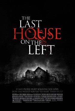
What is striking about the palette used for this advertisement is the lack of colour. The poster’s colours have been de-saturated creating harsh contrasts between blacks and whites. The only colour present on the poster is that of the text ‘House’ which is blood red. The de-saturated image sets a certain tone and mood for the poster and subsequently the film. The black colours connote the film’s dark themes and subject matters, whilst being accentuated by the lack of colour creating a cold, sinister and even chilling tone. This informs consumers what to expect from the film being advertised. Those who are attracted by the notion of being entertained by a forbidding and frightening film (usually through induced adrenaline) will likely find some sort of interest in this poster. The distributors have recognised the importance of colour and have quickly transmitted important information through just the poster’s colour palette.
The only picture that appears on the poster is that of a house which is undeniably the house that the title of the film is referring to. The house is framed in the middle of the poster just vertically below the centre allowing space for the film’s title. The framing of the picture makes consumers aware that the house and its interior are going to be the focus of the film. This is accentuated by the dark rain clouds building around the house almost using the technique pathetic fallacy, commonly used in films, making the house one of the only things visible in the picture. In addition the use of dark rain clouds adds to the ominous tone by suggesting chaos through the idea of a storm. The only other things that can be distinguished in the picture are trees and long grass in the foreground. By putting trees in the picture the house is given a more deadly quality because it gives the impression that it is more secluded.
The font used for the title and slogan is a modern gothic style font, with the Modern Gothic font the title of the film is coloured white. However, the text isn’t pure white with some faint darkened stains and small crevices. It is suggested by the title’s colour that something which was once white (which could suggest innocence, purity or simply something which is clean and once good) has been stained and marked.
Having the word “House” coloured in blood red and the use of an effect making the word look like it has been smeared is very telling. From this the audience can construe that violence and gore are going to play a big part in the film and consequently the ruining of something that was once good which has been suggested by the white stained text. The slogan is also very effective as it divulges information whilst creating mystery. It is suggested that this story is going to be a revenge story by the use of the rhetorical question which is persuasive due to its inclusiveness of consumers “How far would you go to hurt them back?” We know that someone, or some people, will hurt someone for revenge. Consumers are still left with the question of motives, how everything occurs and how the story is concluded.
Analysis of a horror trailer
The Blair Witch Project is a horror film which uses a handheld camera throughout.
Before the trailer begins, a brief message is shown stating that the teaser trailer has been approved for all audiences. This clip is a common convention throughout teaser trailers. It may be suitable for the audiences that view this trailer as, for example, the trailer may only be shown in cinema screens whereby the film being viewed is targeted to the same audience as the trailer itself.
Throughout the trailer, a non diegetic noise is played. It is a very disturbing sound which helps to create a tense atmosphere for the audience.
A clip is used showing the logo for the film production company ‘Artisan Entertainment’. This suggests that the film is a low budget social realism film as ‘Artisan Entertainment’ is an independent film company.
This is then followed clip showing only text, that reads; ‘In October of 1994, three student filmmakers disappeared in the woods near Burkittsville, Maryland whilst shooting a documentary’. This sentence gives the audience an idea of the narrative of the film. It builds suspense and tension for the viewer as it is seen as unusual and abnormal for something or someone to ‘disappear’ so therefore there is something abnormal about the film. Four seconds after, a sentence below reading; ‘A year later their footage was found’ fades onto the screen. The four second gap allows time for the viewer to read the first sentence and build suspense before reading the next line. The text is written in a very basic, plain font. It has been written in white to contrast with the black background. The colour black is the dominating colour throughout the trailer and indicates connotations of darkness and mystery. It is also the colour that symbolises absence, which is what this film is about; the absence of three students.
The trailer then shows a shot of a forest in black and white. We assume that this is the setting of the film. The jagged, unclear filming of the forest creates a sense unease for the viewer. In this clip a quote from a review from Newsday is used, reading; “Genuinely Frightening”. As the clip fades, a diegetic sound of a girl screaming is used. This adds to the suspense being built up.
The next shot used is very unclear with bad lighting. It appears to show a person in the woods covering their face with their hands. Another quote from a review is used which says; ‘One of the creepiest films since The Exorcist’. This quote was taken from Entertainment Weekly. Comparing the film to The Exorcist emphasises the horror of the film as it is renowned for being possibly the most frightening horror film.
A point of view shot is then used of someone running at a fast pace through the woods, with the quote; “Scary as Hell” from Rolling Stone, written on the screen. A diegetic sound is used of a male voice shouting; ‘Tell me where you are, John’. It then fades to complete darkness and the non-diegetic sound becomes louder. The name of the film and the films logo flashes on the screen.
An unsteady shot is used with very bad lighting. The viewer can only just distinguish that it is a shot of the forest. This creates an unsettled feel for the viewers as they have been concealed from the events in the film. It leaves the audience wanting more which is the aim of any teaser trailer.
It then fades to black with the text ‘This Summer’ appearing on the screen, followed by the website address. The same font and colour is used for these texts and the film trailer.
The flashes used before each clip and the non-diegetic echoing sound appear to be similar to thunder and lightning. This helps create suspense and tension throughout the trailer.
