Textual Analysis of a Horror Film Poster
A nightmare on elm street is a legendary film that was first released in the 80’s, the story is about a janitor that used to pervert over young kids in elementary school he was burnt alive by the parents of the children, known as Freddie cougar he killed and haunted kids in their dreams.
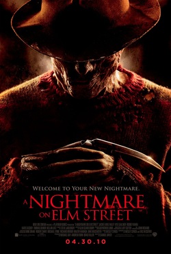
The lighting of the poster background is high key this is to put emphasis on Freddie cougars face in the poster. However the majority of the poster has a low key lighting effect to it. This is all around he’s well known striped red jumper. Having a low key lighting effect is firstly a major convention of a horror movie poster, but it gives the viewer a cold scary outcome.
The NVC shown in the poster shows Freddie cougar giving an evil grin while tilting he’s head slightly down to hide he’s eye. The effect of the tilted head is to hide the emotion in the killer’s eyes, it gives of the sense that we don’t know how he looks because it is known that your eyes are your identity. Also by rubbing he’s hand and scissor hand makes him look so calm about being a killer.
The setting is just in a plain room with some sort of fiery light in the background, they chose to use a medium close up for the image, this shows of the peculiar skin that is well known for Freddie cougar. Also using a medium close-up gives a full effect of the main character. The focus of the image is very soft and clear, he’s famed scissors fingers are the props used in this poster, by using photo shop to put a gleam at the end of the scissors finger, also he’s hat and jumper come under costume. The main image is of Freddie cougar, it is laid out so he is the main part of the poster, and the layout is symmetrical.
The anchorage of the poster goes well with the image it tries to perceive, the font used was new times roman a serif font with flick ups, this connotes tradition and old fashioned because it was original an old film. It was in bold and some letters were smudged, using red for the font related to the setting. The caption which was “welcome to your new nightmare” helps us understand the image and the concept of the film.
Textual Analysis of a Movie Magazine Front Cover
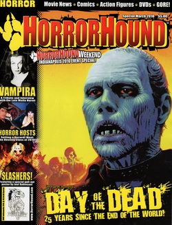
This is a magazine called the Horror Hound which is a magazine about all different types of horror for example horror games, horror action figures, horror comics and much more.
The lighting used in the magazine is a very orange/red vibrant colour; red is a main convention for horror and is used in very effectively this lighting on the front cover. It automatically attracts the reader and may be clearly seen to be a magazine about horror. NVC is shown in this magazine front cover by a Frankenstein type of monster which is on the front cover, he’s mouth is open and it clearly catches the readers attention by he’s facial expression. The setting seems to be in hell or some sort of fiery place, there are zombies of some sort in the background, and this was in actual fact a very good horror background because the viewer will get the sense of fright from looking at it. Even though No props or costumes where used this may be of been done on purpose to keep the reader in suspense.
The camera angle used was just a normal shot in a medium close-up for the image; this was used to fit other horror convention into the image like the zombies in the background. The main image is Frankenstein; the layout of the magazine is asymmetrical and the focus of the image is harsh, a harsh focus was used to give off a horror effect tot the reader.
Textual Analysis of a Movie Magazine Front Cover
A nightmare on elm street movie trailer is 2minute and 8seconds long, which is usually longer than most but a very detailed and clear movie trailer.
The lighting starts of the same throughout as it begins with a flash back of how the legendary Freddie cougar came about, it shows him running with furious parents chasing him into a warehouse where he was burnt alive. Shades of red were a main colour used in the majority of scenes, red is a main component of a horror so was used very effectively. The lighting of the fire was bright and vibrant this put empathises on the pain he went through that made him Freddie cougar. As the trailer goes on the lighting is frequently the same apart from the scenes where it shows Freddie in a dream with he’s victim, the lighting becomes low key. As the trailer comes to an end the pace is picked up and there are more quick cuts that are bright, this technique is done to keep the viewer scared but also hooked. The different settings play one of the major parts of the trailer, for example the scene where Freddie cougar is in he’s type of fiery basement shows the horror of the movie. The costumes and props used where mostly the famous scissors fingers of Freddie cougar, and also blood was used throughout the room.
Sound in this trailer was used very effectively; the first scene was mostly diegetic sound where Freddie cougar and the parents were shouting at each other which also had non-diegetic music playing in the background. This was fast past music which built up the tension right at the beginning of the trailer. As the trailer goes on it return back to diegietc sound with the young girl explaining she is suffering from these weird dreams, closely followed by a voice over which is done by a baby girl repeating the Freddie cougar theme “1 2 I’m coming for you” etc.
